
Why?
I recently went to Geico to look for some car insurance. After finding an acceptable rate, I proceeded to sign in. The signup process was going smoothly, until I checked if my username was available. Being my last name combined with the last name of my fiancee, I had some confidence that I would be okay. I like to check for availability when it allows me, so that I don’t run into any issues down the road. Well, this is what I saw after checking the availability of the username:
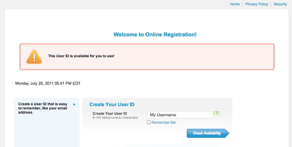
A gigantic red box! How is my username taken? I was in shock…
That is until I actually read the message within the gigantic red box. The username is available for my use. Why mark that message in red? I associate red with an error and my head automatically assumed that the username was bad.
I find it amazing how quickly our brains can detect color and associate it with a meaning long before we have the time to read the message sent. I highly recommend using red highlighting for errors or things of important. Success should never be highlighted red, it doesn’t work with our brain’s reception of color.
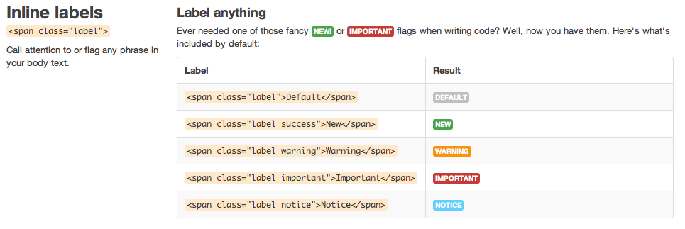
Which colors?
I use Twitter’s Bootstrap to help style this site, and I love it. The nice thing about this pre-defined stylesheet is that it gives you the standard acceptable coloring for all sorts of notifications:
What does everyone think? Does using standard highlighting for notifications really matter? Does Twitter have them right in Bootstrap? I would love to hear your comments below.